Review Article: Population Structure in Genetic Studies: Confounding Factors and Mixed Models

Bioinformatics is a rapidly growing field comprised of multiple academic disciplines. The work of quantitative geneticists is often not well understood by scholars conducting other types of research in Genetics. In response to this information gap, we are launching a series of reviews that are aimed to make common problems in computational biology research accessible to anyone in Genetics. We hope these reviews help researchers in Genetics better understand the scope and applicability of each other’s work, and serve as study guides for students taking college courses on the subject matter.

Today we made available on bioRxiv the first paper in this series, our review of population structure and relatedness in association studies. A genome-wide association study (GWAS) seeks to identify genetic variants that contribute to the development and progression of a specific disease. Over the past 10 years, new approaches using mixed models have emerged to mitigate the deleterious effects of population structure and relatedness in association studies. However, developing GWAS techniques to effectively test for association while correcting for population structure is a computational and statistical challenge. Our review motivates the problem of population structure in association studies using laboratory mouse strains and how it can cause false positives associations. We then motivate mixed models in the context of unmodeled factors.

To read the full review, download our paper: http://biorxiv.org/content/early/2016/12/07/092106.

This review was written by Lana Martin and Eleazar Eskin. We welcome feedback; please e-mail Lana if you have comments or questions: lana [dot] martin [at] ucla [dot] edu.

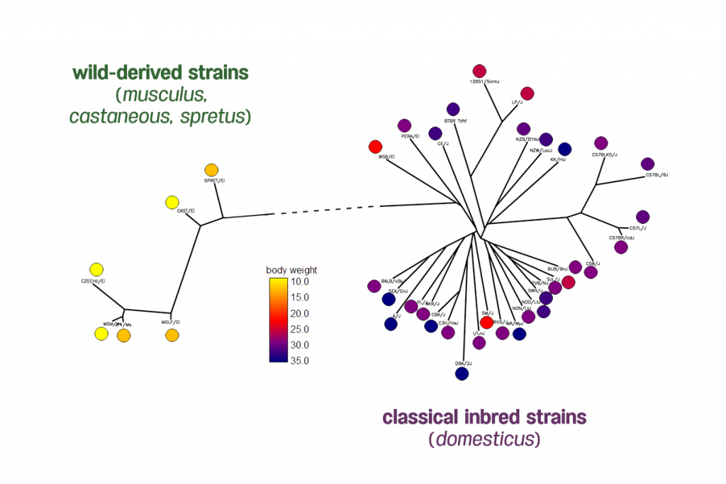
Body weight phenotypes of 38 inbred mouse strains from the Mouse Phenome Database generated by The Jackson Laboratory. The distribution of mice body weights shows two clades of mice have very different body weights.

Writing Tips: Results Subsections

The purpose of a Results section is to present, without interpretation, the key results of your research. Your paper does not need to include every result you obtained during your experiments. Results are “key” when they are relevant to addressing the research questions or hypotheses presented at the beginning of your paper.

We use the Results subsections to show the reader what types of outcomes they can expect when using the methodology that we present. In our papers, we write a “Methods Overview” as the first subsection of the Results section. (We discuss writing the “Methods Overview” subsection in a previous writing tips post.) Remaining subsections in your paper’s Results section present your findings in the form of text, figures, and tables.

Each Results subsection should make a specific point, and the subsection heading should be a succinct description of this message. Effective subsection headings declare a statement that communicates to the reader what the method is capable of doing or what types of data the method can be applied to. For example, in a recent paper published by our group, the heading of a subsection that demonstrates how a new GWAS approach controls for false positive results is: “Phenotype Imputation Controls Type 1 Error.”

Here, a two-paragraph Results subsection has a heading that tells the reader which specific type of analysis is discussed, since the paper presents a method that can be applied toward numerous different analytical tasks.

Cell type composition and diversity


We hypothesized that differences in microbial diversity may be linked to whole blood cell type composition. Since the actual cell counts were not available for these individuals, we used cell-proportion estimates derived from available DNA methylation data to test this hypothesis (Houseman et al. 2012; Aryee et al. 2014; Horvath and Levine 2015).


We assessed methylation data from 65 controls from our replication sample, and compared methylation-derived blood cell proportions to alpha diversity after adjusting for age, gender, RIN, and all technical parameters. We tested whether alpha diversity levels are associated to cell type abundance estimates. Our analysis shows one cell type, CD8+ CD28- CD45RA- cells, to be significantly negatively correlated with alpha diversity after correction for all other cell-count estimates (correlation = -0.41, P=7.3e-4, Figure S6, Table S6). These cells are T cells that lack CD8+ naïve cell markers CD28 and CD45RA and are thought to represent a subpopulation of differentiated CD8+ T cells (Koch et al. 2008; Horvath and Levine 2015). We observed that low alpha diversity correlates with high levels of this population of T cells cell abundance.


Total RNA Sequencing reveals microbial communities in human blood and disease specific effects

Sorry, no publications matched your criteria.

For each subsection, we include one figure that illustrates the heading’s message. The figure’s legend (also referred to as a “caption”) can simply be the subsection heading with additional information explaining the methods and data involved in the visual output. It may be helpful to select a figure and write a legend before composing text for the subsection.

At this point, you could probably write an entire paper on each figure! In general, we limit the text in each Results subsection to one to two paragraphs. Here, we use the minimum amount of text that is necessary to walk our reader through the figure. Think about what the reader needs to know in order to start using the method for their own analysis. Relevant information includes the type of data used, analytical steps and parameters, and a summary of conclusions. In many cases, the subsection text and figure legend will be repetitive.

This one-paragraph section provides relevant results in terms of statistical parameters, numerical output, and a supplemental figure. This subsection gives the reader a good idea of what to expect if they want to incorporate this new approach in their own project.

Phenotype Imputation Controls Type I Error


We simulated datasets for multiple phenotypes under the null model where the variant we are testing has no effect (effect size of zero) toward the target phenotype. We computed the type I error under five different significance thresholds: 0.05, 0.01, 0.005, 5 3 10-6, and 5 3 10-8. We generated 100,000,000 simulated datasets that consist of 1,000 individuals. The type I error rates for our imputation method were 0.049, 0.0099, 0.00489, 4.90 3 10-6, and 4.89 3 10-8 for the significance thresholds of 0.05, 0.01, 0.005, 5 3 10-6, and 5 3 10-8, respectively. This indicates that the type I error is correctly controlled in our imputation method. The Northern Finland Birth Cohort dataset 13 was used to show that the type I error is controlled (see Figure S1). We plot the Q-Q plot of the Z-score for the imputed triglyceride (TG) phenotype from the Finland dataset. There is no inflation in the Q-Qplot as shown in Figure S1.


Imputing Phenotypes for Genome-wide Association Studies

Sorry, no publications matched your criteria.

Bonus challenge: After you finish writing your paper, try to remove the sentence highlighting the result’s importance from the Figure caption.

The order in which you present your results can be organized in many different ways. Typically, ordering of subsections is not important for initial manuscripts. One simple approach is to order Results subsections sequentially to support the argument that you are building in your paper.

Here, we present another example of a Results subsection, including the description of a relevant figure. The subsection heading is making it clear to the reader that this part of the paper discusses applying ForestPMPlot, a visualization tool for analyzing meta-analysis studies, to eQTL data.

Application to multi-tissue eQTL analysis


One powerful application of our proposed framework is in multi-tissue eQTL analysis in the Genotype-Tissue Expression (GTEx) project. The GTEx project studies human gene expression and genetic regulation in multiple tissues, providing valuable insights into the mechanisms of gene regulation, which can lead to the new discovery of disease-related perturbations. In this project, genetic variation between individuals will be examined for correlation with differences in gene expression level to identify regions of the genome that influence whether, and by how much, a gene is expressed. In particular, examining multiple tissues can give us valuable insights into the genetic architecture of the regulatory mechanism, because many regulatory regions are known to act in a tissue specific manner (Ernst et al. 2011; Encode Project Consortium 2012). Hence, understanding the role of regulatory variants, and the tissues in which they act, is essential for the functional interpretation of GWAS loci and insights into disease etiology.


Figure 2 is an example of the output of ForestPMPlot for a multitissue eQTL study for SEMA3B gene (GTEx Consortium 2015). Examining both the forest plot and the PM-Plot allows us to obtain an insight into the tissue-specific genetics effects in eQTL analysis, which leads to the identification of three significant eQTL tissues (heart left ventricle, stomach, and thyroid). This example clearly shows that examining both the forest plot and the PM-Plot allows us to easily hypothesize that there is a specific group of studies showing tissue differences in eQTL analysis.


ForestPMPlot: A Flexible Tool for Visualizing Heterogeneity Between Studies in Meta-analysis

Sorry, no publications matched your criteria.


Below, we provide examples of several different types of figures that can illustrate the point of a Results subsection.

Example of a figure and figure caption that clearly illustrate and explain significance of results in a Results subsection (Hormozdiari et al. 2016).

Example of a figure and figure caption that clearly illustrate and explain significance of results in a Results subsection (Hormozdiari et al. 2016).


Example of a more complex figure and figure caption in a Results subsection, which aim to explain the advantages of a new visualization tool (Kang et al. 2016).

Example of a more complex figure and figure caption in a Results subsection, which aim to explain the advantages of a new visualization tool (Kang et al. 2016).


Example of a general schematic “Methods Overview” subsection figure in the Results section (Mangul et al. 2016).

Example of a general schematic “Methods Overview” subsection figure in the Results section (Mangul et al. 2016).


Writing Tips: Methods Overview

What are the interesting computational ideas underlying a new computational method?  What are the intuitions behind the method?  How is the method related to other methods?  These are the key question that papers which describe new computational methods should be answering.
Unfortunately, most papers describing new computational methods don’t explicitly address these questions due to constraints of the journal styles.  Introduction of methods papers often have a only few sentences about the method.  The Methods section typically has many more details but has very little discussion of the underlying ideas.   Understanding what is interesting about a method is left completely to the readers imagination.  Often, the journals request that the Results section precede the Methods section which then makes understanding the results very difficult without the reader reading the sections of the paper out of order.  Authors can appeal to the journal to have the Methods section first, but this is also not a good solution since there are many details in the Methods such as descriptions of the datasets which take away from the flow of the paper.
In order to avoid these problems, in our papers, we make the first subsection of the Results section of the paper a “Methods Overview.”  In this section, we describe the method in terms of the high level ideas and typically include as a figure a small example which we utilize the help the reader understand the example.   The goal of this section is to give enough details that the readers can then follow the rest of the Results section without requiring looking at the Methods section.  A well written Methods Overview will make it much easier for the reader to follow the actual Methods section.
These sections and examples are designed to be self contained and should be in a language appropriate for a general audience.  In fact, some of the blog posts are almost verbatim copies of the Methods Overview sections of some of our recent papers.  For example, see these blog posts on GRAT and Genome Reassembly.
Another way to think of what to put in the Methods Overview section is what you would explain in a talk about the method.  Often presentations on computational methods have excellent slides showing intuitions and very clear examples.  The place to put that kind of material is in the Methods Overview.  Remember, in your paper you must give a compelling argument as to WHY your method is interesting. If your readers don’t understand the intuitions underlying your work, they will never appreciate it.
I’m sure you may be asking, “Isn’t this a little redundant?” What I’m proposing here may be a bit repetitive, with a methods overview section and a methods section later in the paper.  But they serve different purposes.  With a well written Methods Overview section, a reader can stop after the Results section and understand most of your paper.  The Methods section then only becomes important for someone who wants to understand all of the details.